
The Perth Budgerigars


Go Perth Budgies! I'm excited to share with you a passion project of mine that I've thought about for years in the making. The Perth Budgerigars (or Budgies) are a women's soccer team from Perth, Australia. After doing some research on the sports teams of Australia, even though it's not for a real team, I still want to solve a real problem. I found that Australia is lacking in the soccer world, especially women's soccer. They haven't had any championships in a while. So I figured, perfect! I'll make a team. Why Perth, Australia? Budgies (also known as parakeets) are native to Western Australia, where Perth is the capital city. I always wanted to make a sports team where budgies are the mascot because they make the best pets! They have so much personality, they're lifelong learners, and can have a variety of music tastes. I can't believe there isn't a budgie team yet!
I can't wait to talk about this brand, so here we go! I started with a mood board. Of course, I needed to have the perfect budgie image for my logo. I love this green guy because he has a great pose. I knew that if I got his silhouette, it would be the equivalent of “Guess that Pokémon” (well, for people who know budgies well). I also included pictures of Perth with one of its waterways nearby. Perth is known for having super blue water, and budgies are also surrounded by H2O, so I knew that the color blue had to be included in the brand! The last image was chosen to symbolize teamwork because budgies travel in large flocks, and they use their numbers against predators by flying away together.
For the font, I chose Bugar Sport (no, not because of the name). When I found it, I thought it was so perfect! I was looking for a thin font that looks different. A thin font was wanted because it reminds me of the budgies' small size. The sharp corners inside and out of this font create movement, which reminded me of the budgies' speed. Now onto the colors! Green had to be the main one because Budgies are naturally green (fyi, any budgie you see in a different color is that way because of breeding). I chose this hue of green because it reminded me of the vivid colors in Perth. Everything seems to have a blueish tint there. Have you noticed that from the picture above? I also chose two different blues: an almost white Alice Blue and a cute Powder Blue. Alice Blue is for the waters of Australia, and Powder Blue is for a combination of professionalism and cuteness. Budgies are cute and friendly, so I wanted to add that element there. (Dark blue is often the color for professionals like cops and mechanics, so that's what I meant.) You can't have a sports logo without including the mascot, so I added pink for the bird's feet.
Now, we're onto the logos! I definitely wanted to create an emblem logo, 1: because most soccer logos are, and 2: because they make you look like you've been around for a while. You're high-class, trustworthy, and confident. Perth, Australia, is not a cheap place! I wanted to give this brand a polished look to fit with the location. For the body of the logo, I wanted to create a shield. The top of the shield is narrow so that the city, "Perth", in green will fit perfectly inside. The shield loops into two sharp corners, then wider corners, and is finally brought down to a point at the bottom. The loops represent waves. I made the bottom loops bigger and wider than the ones at the top because I wanted to create a unique shape. Plus, shields do get wider at the sides, so it only made sense. I made the shield light blue since it's close to white, and that would give it that high-class feel. The outline of the shield is in Powder Blue because I wanted to keep the blues together, continuing with the water theme. In the middle is a silhouette of a bird in the middle. I only added a green body and pink feet for a less-is-more approach. I tried adding more detail, such as a beak and wing, but it took away from the rest of the logo. So I figured to stay simple instead of doing a contrast. Under the bird is "Budgerigars" in big green letters since that is the primary color. I also added a water-like texture to it, continuing with the water theme. Only the bottom half is texturized (I know that's not a real word, you gotta get to know me more! lol) to mimic the separation of land and sea. I also added a pale blue background for the word. Now that everything was done, I felt there was something missing. I took inspiration from a design tutorial to use the initials of the Perth Budgerigars, but I flipped the "P" so the letters' backs are facing each other, and then I combined them. I made them really small in green and put them under "Budgerigars". And just like that, the main logo is done!
For the black and white logo variations of this logo, I used the outline of the shield that was once powder blue because I wanted the bird to be in color, for legibility purposes, and he's the main focus. For those reasons, I also removed the background for the word, Budgerigars. Everything has stayed the same, so all that was left was to make everything white for one logo, then make everything black. How you liking it?
For the sub mark logo (the logo used for even smaller spaces, like a YouTube icon on the bottom right side of a video), I only kept the shield and bird. Similar to the main logo, the black and white variations of this logo include an outline of the shield with the bird taking center stage in color.
For the first marketing tool, I designed the team's uniforms. Of course, they're green. The sleeves are light blue to give it a clean look, and I don't want it to take away from the green. The main logo is on the bottom right side of the shorts and the top left side of the jersey because that's how soccer uniforms look.
For the second marketing tool, I created a shirt for fans to enjoy. I decided to make it simple and let the team colors do the talking. The shirt color is the classic green, along with white letters. I didn’t include the blue this time because it would’ve been hard to read against the green. I used Budger sport and the words spell out I’m a budgie, as in a fan of the Perth budgerigars, of course, you get it. I added a green stroke followed by a white stroke to give the words depth. On the bottom, I put the team’s initials together and made their “backs” face each other and together, like in the main logo. This is to keep a cohesive brand and have something that could be identified in such small text. I also included the team’s name at the bottom and spread out the letters to bring attention to it. After all, this is about the PB! Gotta pay homage to the team!
For the final marketing tool, I designed a sports tent so the athletes could unwind. The tent is in pale blue, going back to the high-class look. For the eaves, I used the sub mark logo in the middle with the secondary on each side. This is the present information right away. What is the name? Perth Budgerigars. What is the general gist of their logo? A shield with a bird on it. For the top of the tent, I just added the bird. This is also to present information. He is the mascot, after all. For the inside, the main logo is placed because it's the one most people would be familiar with. It's gotta be front and center!
For the secondary logo (the logo used for smaller spaces, typically horizontal, like a business card), I removed the visuals and put the words closer together. Perth is placed on the top left side. I didn't want to put it in the middle because that would be too predictable. It felt organized that way since we read from left to right. As you can already predict, the black and white variations of this logo will also be simple. Nothing but text, no effect either. The effect won't help with printing; it would look weird, trust me.


Photo Credit: Perth with Lights, Bird, Perth near Water, Hands


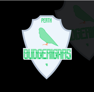


Photo Credit: Image by Laura Rincón


Photo Credit: Sports Tent
Deliverables
Logo Suite
Main Logo
Secondary Logo
Sub mark Logo
Black and White Variations of Each
3 Marketing Tools
5 Instagram Story Highlight Covers
Now it's time for the social media covers! For the cover art, I just used the bird and Budger Sport for the text in pink to contrast with the green (they are opposites on the color wheel). Since the bird is the mascot, he had to be in there, and with green being the main color, it had to be there too. I didn't want to complicate it because these images will be very small. I added story ideas like '25 Schedule and Community because these are some of the ones I've been in teams like the New York Jets and the Denver Nuggets.

If you reached all the way to the end, thank you! This project was fun to design as well as write about (sort of, lol). I really wanted you guys to understand my thought process, so I made sure to go through the details thoroughly. And if you're ready to start a project with me, come on over to the contact section to get started!
Other Works


LinkedIn can be fun too. Check it out there and see!

