Bronx Sugar
Bronx Sugar is an upcoming online clothing store that sells urban and afro urban apparel and accessories. Afro Urban fashion is a combination of street and African styles. It's also heavily influenced by hip-hop. This project was quite challenging for me and required research on my part because even though, Ive seen the style before, I really wanted to make sure I understood it perfectly to get it right. It was actually really fun! After Stephanie, the owner, completed my contact form, I scheduled a phone call with her and learned a lot about her plans for the business. She was looking for a logo, business card, envelope, and thank you note to help her get started in the world of fashion. She loves hip-hop and the fashion styles that are influenced by it. She also loves Africa and likes to incorporate prints into her wardrobe. She wants black people to love their roots and never be afraid to express themselves boldly. In the future, she would like to own several stores across the country to keep black culture alive.
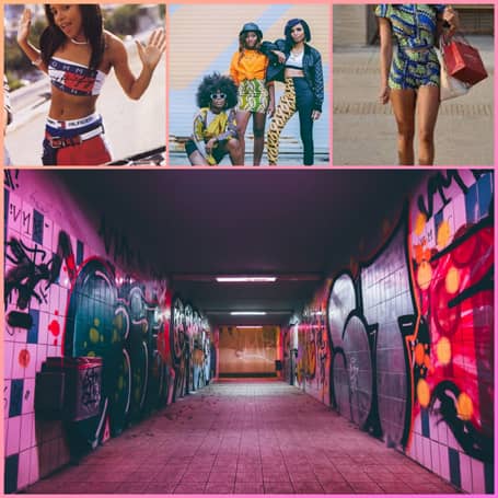
As I requested, Stephanie sent me her mood board to better understand what she's looking for. Graffiti was the biggest image and I understood why because it's one of the first things people think of when they think of hip hop. For this reason, she wanted to incorporate it into the logo. I also noticed loud colors and unique prints in the other images. I know a lot about New York so I was aware of Hip Hop's love of strong colors, especially in the 90s.
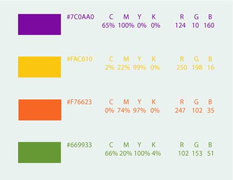
For the fonts, I chose Edwardian Script ITC and Century Gothic. Steph mentioned that her main target audience is women so I went with Edwardian as the main font because it's very feminine. I also wanted to use a font that is eye-catching to match the boldness of this brand! For the secondary font, I chose century gothic because it's quite the opposite. Edwardian makes such a big statement so pairing it with a comfortable, extremely legible font works so well! As for the colors, I went with a bright palette. African clothes have loud colors. They often use more than two so I used four to keep things interesting. I experimented with three but it felt like it was not elaborate enough. I started with a strong purple because it's the color of creativity and power. I wanted these attributes to be on the customers' minds because I want them to feel confident and unafraid to step outside what's comfortable. The next two colors I chose were yellow and orange because they remind me of a sunset over the horizon in Africa. Think of that hazy photo of a sunset with a giraffe on the right side. The last color I chose was green because Stephanie mentioned she wanted a hue that's similar to money so that it matches an illustration of a cartoon version of her holding cash.
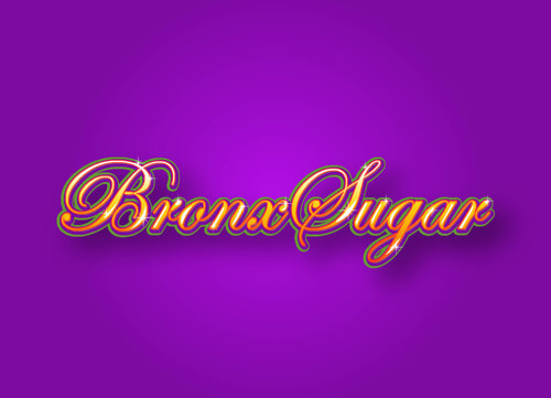 Now onto the logo. I decided that the main colors will be orange and yellow. Orange is the color of optimism and happiness. And according to Adobe, brands use orange to get people excited about something, which is exactly what Stephanie needs to break into the fashion world! I also added yellow to create a gradient effect that graffiti artists often use. I used yellow because it's the closest to orange on the color wheel and I didn't want to take away from it, only add it! The green and purple are used for the outline to add depth because they're the darker colors and I wanted a contrast with the brighter ones. Purple is the biggest outline because it's the darkest of the two. Finally, I finished it off with white strokes and sparkles to create a shine and gloss effect, often a staple for graffiti art! Now let's more on to the variations
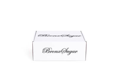
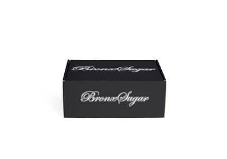
For the alternative logos, I decided to keep them simple because they will be used in the brand's packaging. They needed to be a little more readable but fun. I created a black logo for light-colored boxes and a white one for dark boxes, including the standard brown. For each logo, I gave them only two strokes instead of three, like the main one, because they became unreadable when I tried. Each logo has black and white strokes in different orders depending on the main color of the logo in order to make it look interesting instead of typing the company's name in one color. It also resembles the original logo even if it doesn't have a gradient and added stuffs. They still look like they belong on a graffiti wall!
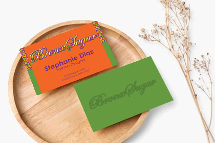

Steph wanted a business card and I started it off with an orange background for the front because I wanted a bright color but I don't want it to take away from the logo, which is why I didn't choose yellow. I didn't choose green or purple either because it would make one of the strokes in the logo disappear. Then I added a border to make things interesting. I made two columns to go on each side of the card with a triangular design to form a bold, colorful pattern. I went with triangles because they're a common shape in African patterns. I added smaller triangles within each one to make an even more intricate design. Then, I stacked them up to create columns but I stopped at the foot of Bronx Sugar because if I brought the pattern down, it would compete with the logo. For the color of the text, I contrasted the background with purple because green, the second darkest color of the palette, will be used for the back. For the text itself, I simply added Stephanie's name and her role in the business since the card is busy enough. We don't want to complicate things. Inspiration for the back of the card came once again from Stephanie's illustration. The background was set to money green with the logo in a darker green. This is to display that the logo will have an embossed (raised text or 3D appearance) effect when it's printed. This is the final icing on the cake to make it pop! Hip-hop and afro-centric culture alike is about making a statement!

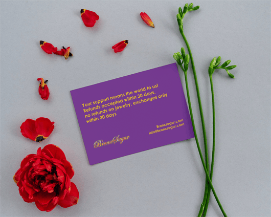
Now onto the thank you note that customers will receive with their order. For this design, I let the colors do the talking with just a little design. I took a different approach because patterns aren't the only way to be bold. I took inspiration from hip-hop. Women, especially, love loud colors with their denim and timberland boots. So, instead of patterns, I let the colors speak for themselves. For the front, I gave it a yellow background because it's the brightest. The words "Thank you" are in purple because I wanted to contrast the brightest color with the darkest one in the palette. This also makes sure everything is easy to read. I used the Edwardian font because it's very decorative. Besides, the note shouldn't be that simple! Surrounding it are triangles as inspo from the design of the business card but with a twist. I designed several triangles in different colors and sizes. Some are alone while others are together because I wanted them to look scattered as if they are forming a circle around the words. On the back, the colors are switched and I used Century Gothic as the font this time because Stephanie wanted to add a note from her, and Edwardian would have been too harsh on the eyes. Then, I added the logo so it isn't too plain, and contact information because that's always helpful.


Next, Steph needed an envelope. For the envelope, I went with a purple background and yellow letters to match the thank you note. Of course, I used Century Gothic for legibility. (For privacy reasons, the addresses are fake) I also decided to give it a border because I wanted to be consistent with the business card. But instead of using the same border, I used a stroke that looks drawn and more heavy-handed in some areas to make it look modern. I used the other three colors to make three borders to once again create a pattern. On the back, I used the same design as the business card for the entire flap of the envelope for consistency and distinctness. For this last design, I wanted to combine simplicity and embellishment to tie the three together. The business card is decorative, and the thank you note is minimalistic, so I wanted to put these two contrasting styles together.


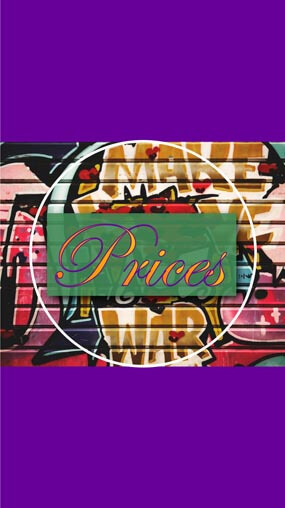
Last but not least, the Instagram highlight story covers. I used a graffiti background cover found here so that the gradient text looks like it's part of the graffiti, adding to the aesthetic even further. To make the text a little more readable against the busy background image, a see-through green text background was placed behind it.
If you made it this far, thank you! I hope this helped you understand my thought process and decide to take your brand to the next level! See you in the Contact section!


